

5 Ways To Transform Your Retail Space
As the holiday season approaches, you’re busy preparing for the flood of people that are about to embark on holiday shopping excursions. You have your inventory ordered and staffing arranged, but have you given a thought to the visual experience that each customer will have when they enter your shop? Have you transformed your retail space to draw customers in and give them the complete experience—the ultimate, visual WOW? Here’s a few tips to really make your store POP!:
Transform Window Spaces
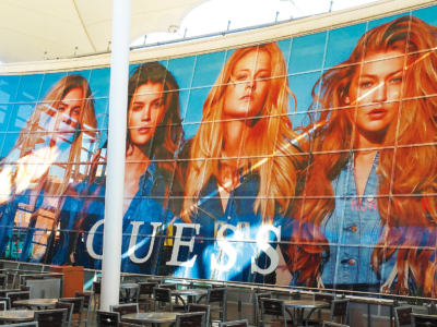
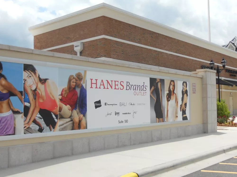
Obviously the outside of your store is what visitors see first—whether it’s your building architecture, the brand sign, or the window front. While the crowds of people are moving past your store, entice them to stop in and learn about your brand and products with irresistible window graphics and messaging! A vibrant, creative display covering your whole window can add holiday cheer and an extra stream of people through your doors.
The Walls are Your Canvas!
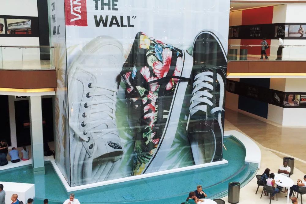
Now that your window display has motivated passers-by to stop and and check out your wares, have you given any thought to livening up the store by adding color, graphics, or messaging to your walls? Probably not. Just think, that empty wall is your canvas to do with as you wish! Add holiday cheer! Advertise sales! Or maybe just a colorful, patterned design to add some pizzazz to your place, and encourage patrons to linger a bit longer. Printed decals make it easy—no more paint cans, brushes, or stencils. NO MORE MESS! Your wall is your oyster… do whatever you wish to it and decorate it to your heart’s content. Make it shine! It’s all about the customer experience, and good design increases the chance that customers will return to your store.
Effectively Use Floor Space
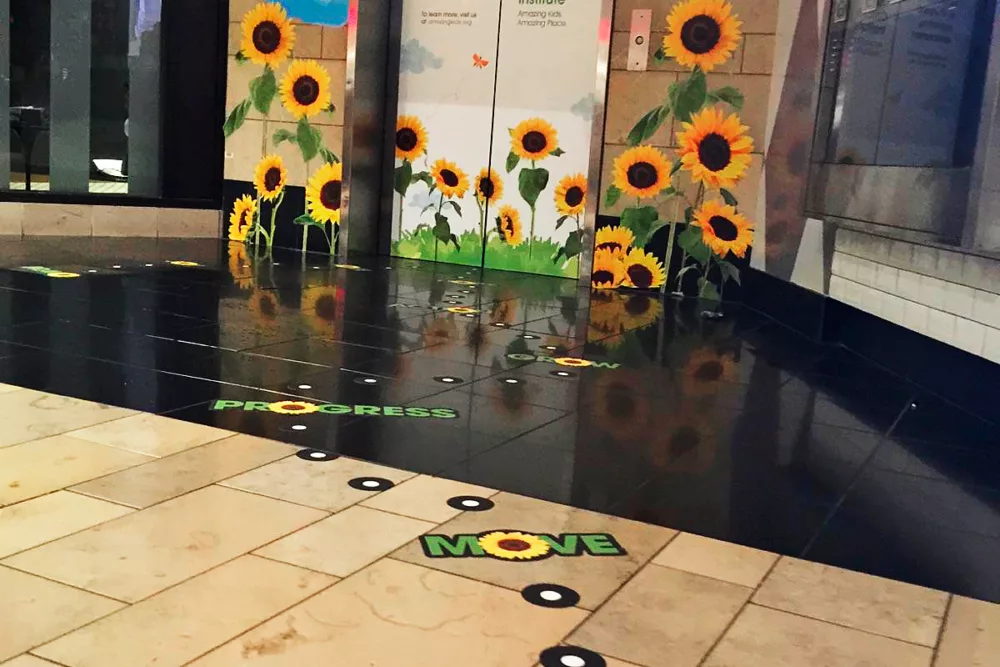
When it comes to “floor space,” you’re probably thinking about the logistics regarding clothing racks and displays. While this is definitely important, you can also think of floor space as the empty area that is available for you to use to enhance your customer’s experience. Perhaps you could use it to add color to your storefront, advertise holiday sales, or for way-finding around your store. One of my favorite examples of a brand effectively using floor space was L.L. Bean’s floor graphics depicting a pond and trail. The trail led throughout the mall with a description that read “Follow me to L.L. Bean.” With people’s inherent reaction to following signs, floor graphics could be a valuable marketing tool for your store during this holiday season—an effective tactic for toy stores and other children’s retailers.
Draw Attention to Your Brand with LED Backlit Signs
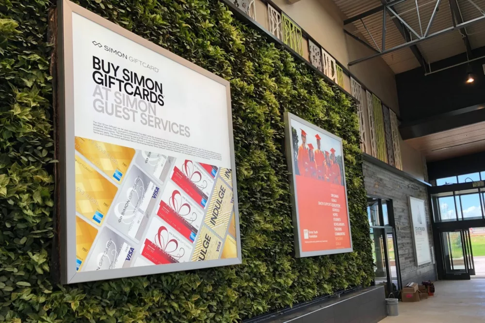
If you’re looking for a way to make your storefront really SHINE compared the others on the strip, an LED backlit sign would do the trick. The light box remains installed on your storefront, while the bright, shiny banner can be changed whenever you want! Just think of the possibilities—your store could BEAM with holiday cheer and add a BRILLIANT aura to the location.
Use SkyBanner Systems to Utilize Ceiling Space
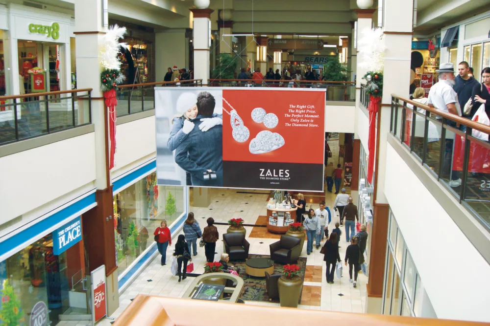
While the holiday season is in full-swing, why not add some extra holiday cheer to the air? Literally. Use a SkyBanner system to shout “MERRY CHRISTMAS,” making your brand really shout over the rest. There is also the potential to generate extra advertising revenue by letting the brands you carry advertise in your spaces. Put that empty ceiling space to work, whether it’s through holiday greetings or advertisements. Either way, it’s win-win for you!
In the Fast Company article “Four Keys to Surviving the Future of Retail,” Method’s Alexander Grünsteidl states that “Designing these new shopping experiences is not just about immediate sales but about creating opportunities to facilitate impulse purchases.” Eye-popping, dazzling visuals are a great way to facilitate impulse buying—or at least drive an increased number of people through your door. By leveraging real estate that you already own—your windows, walls, floors, and ceilings—you not only gain a leg up on the competition with increased advertisements, but you’ll give your customers a shopping experience to remember with your stellar visuals and holiday cheer!
